TL;DR — Rendered.ai has built a novel analysis method for assessing the relevant feature similarity of synthetic image data to real data of the target domain. The method uses UMAP dimensionality reduction to view image embedding features as a three-dimensional plot.

Overview
Synthetic data is engineered, or simulated, data that can be used to train and validate AI. In the computer vision realm, which typically focuses on unstructured data such as imagery or video, synthetic data can be created using 3D simulation techniques and through generative AI approaches. At Rendered.ai, we typically focus on simulation approaches.
This article describes a new approach to dataset comparison and quality assessment for unstructured synthetic data. This approach involves a human-in-the-loop method of visualizing image features in embedding space to identify overall trends in dataset attributes and whether key features are accurately represented in synthetic data.
Introduction
One of the most fundamental questions to ask when using synthetic data to train AI is: “Will my synthetic data function as if it were real data?” After all, if the answer is “no,” then your synthetic data is generally not going to be effective for training.
In the context of visible spectrum computer vision data, the first test that’s done to answer this question is “well, does my synthetic data look like my real data?” This is a valid first test that can be easily run by anyone with eyes, and if the answer falls far short of “yes,” it often means that we need to re-think our approach.
But this test does not answer the question of whether our synthetic data will actually be useful in our AI pipelines. For one, computer vision models pick up on features that may not be obvious to the human eye. Slight differences in the characteristics of an image, even those imperceptible to the human eye, can dramatically impact how a deep learning model perceives it. Therefore, even if an image looks real to us, we cannot be certain that our AI models will agree.
Conversely, not all features of real data need to be emulated for synthetic data to be useful, just the important ones. It’s helpful to remember that no matter how complex your simulator is, all simulation is an approximation of reality, and chasing realism for realism’s sake can have rapidly diminishing returns. If the right features are accurately represented in our data, we can start to get the results we’re after without spending time simulating unimportant features.
After visual review, the next test that’s typically done is to train a model. This can mean training solely on synthetic data and testing against real data, or training with a mix of real and synthetic data and seeing if this improves scores over training on real only. This is the “moment of truth” for synthetic data, a moment that either validates or invalidates our efforts. It’s also a moment where many people give up on synthetic data if it does not move the needle in a positive way, and we have spoken with many people who have reached this point and concluded that synthetic data simply doesn’t work.
To be clear, synthetic data does indeed work when applied correctly and there are many real-world proof points, but when confronted with at poor model results with little explanation, it can be easy to come to the conclusion that synthetic data doesn’t work. To properly analyze synthetic data and compare it with real data, we need to get more concrete information than what we can observe with our eyes, yet more nuanced information than overall model outcomes. We need to peer behind the curtain of how a deep learning model interprets the data.
Visualizing the Feature Pyramid
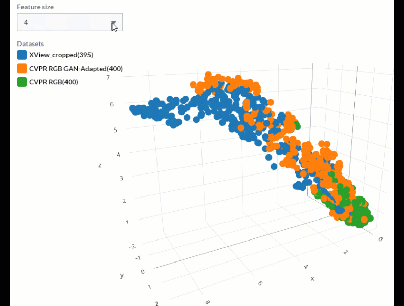
First, a bit of review. A Convolutional Neural Network, or CNN, applies a variety of weighted convolutional layers to images to extract statistical coefficients, referred to as features, from those images that trigger activation functions, or neurons, that inform inferencing. The complex features found in an input image are reduced and refactored into embeddings — dense numerical vectors that preserve certain information about the image like color, texture, shape, and composition. These embeddings are typically hidden from the end user, and they are not especially informative in their raw form. If we can find a way to simplify these features for analysis, however, such as by reducing the dimensionality of these vectors from “n” dimensions down to three, we can plot these values on a 3-dimensional graph and suddenly comparison between features found in different images and datasets becomes possible.
A good tool for this type of dimensionality reduction is the Uniform Manifold Approximation and Projection technique, or UMAP. This methodology works to preserve distances between data points in high dimensional space when represented in reduced dimensions. Clusters and outliers found within the low-dimensional space are representative of patterns found in the source data. Therefore, if we pull embedding features from two sets of images run through the same CNN and plot their reduced-dimension points in 3D space, we can begin to see which features are comparable (i.e., clustered together), and which are not (outliers).

Of course, these features are generated when input images are inferenced against a trained CNN, making a trained model a prerequisite for this analysis. However, as synthetic data may be required to effectively train your model, this becomes a catch 22 that ends up defeating the intent. Thankfully, we have found that using a model trained to detect many diverse features, like those in the 82 well-represented objects in the COCO dataset, we are able to identify a generic set of features found within nearly any dataset.
Combining this technique with a Feature Pyramid Network allows us to expand this comparison to show features at various spatial scales within the image. The diagram below shows how this works, effectively reducing dimensionality from a variety of n-dimensional vectors down to three dimensions.
It is helpful to then view these different levels of the pyramid separately to see what clusters and outliers exist within our datasets at each spatial scale associated with every level of the feature pyramid.
How to approach synthetic dataset comparison
While there are methods, such as Frechet Inception Distance (FID), that will provide a metric that describes the similarity of one image dataset to another, the actionable outcome of this type of analysis is vague at best. Conversely, the analysis described here relies heavily on having a human in the loop that is aware of the desired outcome of a given synthetic dataset, and what features need to be well represented within that dataset for it to be effective.
With that in mind, we can inspect the set of features found in a real dataset that lie outside of clusters from the features found in a corresponding synthetic dataset and ask, “are these features that need to be captured in my synthetic data?” If so, we can go back to the task of synthetic data engineering with valuable information about what changes we can make to our simulation pipeline to achieve more representative and effective synthetic data.

The UMAP approach to synthetic image comparison is one assessment of many that goes into effective synthetic data engineering. It can help identify which features are missing from a dataset and can more clearly show which changes result in improvements in data quality and which do not. It can help us to peer behind the curtain of the deep learning model and take a more scientific approach to synthetic data, an approach that we find is critical to success, and which is best served by a purpose-built synthetic data platform.
UMAP analysis in the Rendered.ai platform
We’ve built the UMAP analysis method into the Rendered.ai PaaS for quick and responsive dataset comparison right at your fingertips. To see synthetic dataset comparison with UMAP in action, check out the video below. Or better yet, request access for a free trial of the platform to try it out for yourself!
Interested in learning more? Here are some additional resources:

